

Livermore Labs’ Energy Flow Chart: A Map for America’s Energy Future
The Lawrence Livermore National Laboratory (LLNL) energy flow chart has become a vital annual snapshot of the massive, complex web that is the U.S. energy system. Every year, this single-page diagram condenses the nation’s energy journey—from the sources we rely on to the destinations where energy is put to use, and, crucially, reveals how much is lost to inefficiency. The resulting picture is not merely an infographic: it is a call to action for industry, policymakers, and citizens.
What is the LLNL Energy Flow Chart?
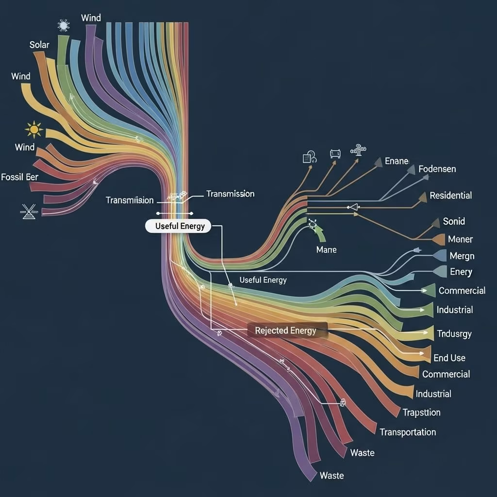
Originating in the mid-1970s as part of LLNL’s energy security mission, the energy flow chart—also known as a Sankey diagram—visualizes the movement of energy resources through the U.S. economy . LLNL uses quantitative data (measured in quadrillion British thermal units, or “quads”) to show energy inputs, outputs, and losses across economic sectors. Lines in the chart vary in thickness according to volume, and color-coding differentiates between energy sources such as coal, petroleum, nuclear, renewables, and more.
- Purpose: To clarify the complex relationships among energy sources, uses, and inefficiencies .
- Format: Sankey diagram—flowing from left (sources) to right (end uses & waste) .
- Unit: Quads (quadrillion BTUs)—for cross-comparison between different forms of energy .
Dissecting the Chart: Key Components Explained
| Chart Component | Description |
|---|---|
| Energy Resources | Primary sources (coal, oil, natural gas, nuclear, solar, wind, hydro, biomass, geothermal). |
| End Uses | Sectors (residential, commercial, industrial, transportation) receiving energy. |
| Energy Services | Useful work output; the portion of energy that is productively used. |
| Rejected Energy | Energy lost, mainly as waste heat, due to inefficiency in conversion and use. |
The Story Each Year: Sources, Consumption, and Loss
Every edition of the LLNL chart traces three foundational pathways:
- Where energy comes from: A mix of fossil fuels, nuclear, and renewables. Fossil fuels still dominate, but renewables have gradually increased their share .
- Where energy is used: Industry and transportation remain major consumers, and trends in electrification are visible year-over-year.
- Where energy is lost: Perhaps the chart’s most striking insight: the majority of energy gets rejected as heat and never powers any meaningful work .
Why So Much Rejected Energy?
“Rejected energy” is best understood as the sum of inefficiencies across the national energy landscape. Most losses occur in thermal conversion (burning fuels to make electricity, propel vehicles, etc.), since even the best technologies (\u003e90% for some electric motors, \u003c40% for most combustion engines) shed vast quantities of low-grade heat .
- Thermal power plants can lose two-thirds of input energy to cooling water and exhaust.
- Internal combustion engines in vehicles convert only about 25-30% of gasoline’s energy into motion.
- Industrial processes often dump excess heat into the surroundings.
In total, more energy is “rejected” every year than used for productive services—an inefficiency challenge woven deep into the fabric of America’s infrastructure.
The Historical Arc: Change in Sources and Efficiency
LLNL’s chart has tracked energy evolution through oil shocks, new technologies, and shifting priorities :
- Coal use: Once king, now receding as natural gas and renewables expand.
- Petroleum: Still crucial for transportation but under pressure from electric vehicle growth.
- Renewables: Solar and wind have moved from negligible slices to substantial flows, especially in electricity generation.
- Efficiency: Advances in appliances, vehicles, and building codes have improved the fraction of useful energy, but the bulk is still lost .
Lessons from the Chart: What Should We Do?
1. Prioritize Electrification
The chart suggests a critical opportunity: shifting end-uses to electricity powered by higher-efficiency sources and renewables. Electric technologies (such as heat pumps, EVs, and induction motors) operate at far greater efficiency than combustion-based alternatives .
- Electric vehicles convert 60-80% of grid energy to motion, compared to 25-30% for gasoline cars.
- Heat pumps can deliver up to 3-4 times more heat energy than they consume in electricity.
2. Move Away from Combustion Where Possible
Combustion engines and boilers, whether fueled by coal, oil, or gas, are fundamentally inefficient. The LLNL chart shows huge energy volumes vanishing as rejected heat in these sectors. Whereas switch to direct use of electricity or renewable heat not only saves primary energy but also slashes emissions.
3. Boost End-Use Efficiency
- Invest in building upgrades, insulation, and efficient appliances.
- Promote industrial processes that reuse waste heat.
- Support behavioral shifts toward consuming less energy where possible.
4. Decarbonize Power Generation
- Accelerate deployment of solar, wind, hydro, and battery storage.
- Modernize the grid to handle variable renewables and distributed resources.
The Chart as a Roadmap for Policymakers and Everyone Else
Because the LLNL chart is updated annually, it offers policymakers, utilities, and planners a transparent metric for tracking the impact of energy and climate policy. Notable shifts—such as accelerated wind deployment or switching homes from oil to electricity—are immediately visualized, allowing for data-informed decision making .
- Policymakers: Can use the chart to prioritize investments with the biggest efficiency payoff.
- Industry: Can pinpoint systemic inefficiencies and opportunities for optimization.
- Civilians: Gain insight into the importance of personal choices in appliances, vehicles, heating, and cooling.
Are We Improving? The Yearly Pulse
Each chart reflects incremental but critical progress. In recent years, total energy consumption has grown more slowly, but improvements in end-use efficiency and growing renewable energy footprints are detectable. However, rejected energy still often rivals or exceeds energy services in scale, underscoring just how much work remains .
The Future: What Should the Chart Look Like in 2040?
The LLNL chart’s ideal future—driven by advancements and smart policy—would show:
- Thicker flows from solar, wind, and battery storage.
- Sharply reduced flows of rejected energy as electrification and re-use of waste heat expand.
- Smaller fossil fuel inputs, supplanted by renewables and nuclear.
- Higher fractions of energy services, signaling broad upgrades in efficiency across every sector.
FAQs: The LLNL Energy Flow Chart Explained
Q: What is a Sankey diagram and why is it used?
A: A Sankey diagram is a flowchart that visualizes the magnitude and direction of resource flows—from source to destination—using proportional lines. It is widely used for energy accounting due to its power to show complex relationships and inefficiencies at a glance .
Q: Why does the U.S. waste so much energy?
A: Most waste comes from technological limits: heat lost in electricity generation, engines, and industrial processes. Current infrastructure and reliance on combustion are inherently inefficient compared to direct electrical uses .
Q: Can we ever eliminate rejected energy?
A: Not entirely—some losses are unavoidable. However, by switching to highly efficient technologies and maximizing renewable energy, the proportion of energy services can grow dramatically .
Q: What do the chart’s colors and line widths mean?
A: Colors distinguish source types (e.g., green for renewables, black for coal), while line width indicates the volume of energy “flowing” along that path .
Q: How often is the chart updated?
A: Annually, based on the latest data from the U.S. Energy Information Administration and LLNL analysis .
Conclusion: A Visual Mandate for Change
LLNL’s energy flow chart may look technical, but its message is accessible and urgent. By making it easy to see how energy moves, gets used, and is wasted, it defines where improvement must happen. If America is to build a sustainable energy economy, it must:
- Quickly electrify more end uses, phasing out inefficient combustion methods.
- Upgrade into renewable sources and smarter technologies.
- Push efficiency from homes and vehicles to industry and infrastructure.
The chart is both a yearly diagnostic and a roadmap. It is up to society—armed with such transparent information—to commit to the lasting changes its lines point toward.
References
- https://gs.llnl.gov/energy-homeland-security/energy-security/energy-flow-charts
- https://www.youtube.com/watch?v=OBuAzxp3EE0
- https://str.llnl.gov/past-issues/february-2021/charting-nations-energy-use
- https://flowcharts.llnl.gov
- https://www.youtube.com/watch?v=G6dlvECRfcI
- https://angrybearblog.com/2024/11/lessons-from-livermores-2023-energy-consumption-chart
- https://flowcharts.llnl.gov/commodities/energy
- https://www.e-education.psu.edu/earth109/node/845
- https://lloydalter.substack.com/p/lessons-from-livermores-2022-energy