


Table of Contents
\
- \
- Introduction
- Definition: What Are Dark Patterns?
- Historical Context and Origins
- Types of Dark Patterns in UX Design
- Psychology Behind Dark Patterns
- Unmindful User Behavior and Its Role
- Impact on Users, Brands, and Society
- Identifying & Preventing Dark Patterns
- Best Practices for Ethical UX Design
- Frequently Asked Questions
- Conclusion
\
\
\
\
\
\
\
\
\
\
\
\
Introduction
\
In the digital age, UX design shapes nearly every interaction users have with websites and apps. While the goal should always be usability, accessibility, and trust, recent years have seen a proliferation of manipulative design patterns, known as dark patterns. These tricks exploit user psychology and habitual behaviors, pushing individuals toward actions they never intended. Compounding the problem, unmindful digital behavior — the tendency to skim, act hastily, or ignore details — magnifies the effectiveness of these deceptive tactics. Understanding the mechanisms, types, and ethical implications is critical for designers, businesses, and consumers alike.
\
Definition: What Are Dark Patterns?
\
The term dark patterns was coined in 2010 by UX designer Harry Brignull. He defines a dark pattern as a user interface “carefully crafted to trick users into doing things that are not in their interest and is usually at their expense.” Essentially, dark patterns exploit design convention and psychological blind spots, engineering consent for actions users do not genuinely endorse — such as unwanted purchases, subscriptions, or data sharing.
\
Historical Context and Origins
\
Dark patterns are not new in principle — manipulative design traces its roots to advertising and marketing. However, the digital environment provides unprecedented scale and subtlety. As Harry Brignull observed, most people “skim read and make assumptions” online. The busy, distracted digital user is uniquely susceptible to interface-based deception.
\
Types of Dark Patterns in UX Design
\
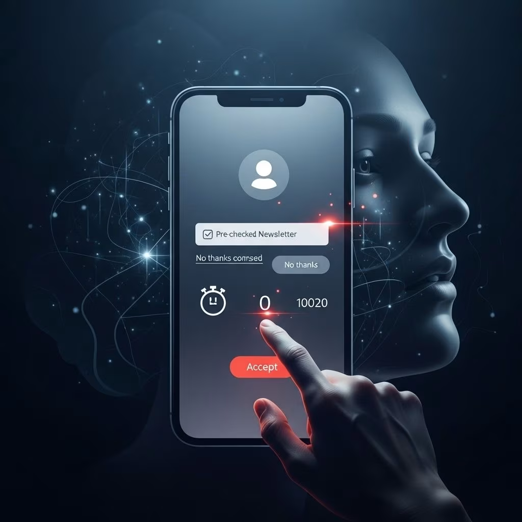
Expert research has identified numerous distinct dark pattern types, each engineered for misdirection or manipulation. Below is a breakdown of common tactics, including examples:
\
- \
- Bait and Switch: Users try to perform one action but the interface triggers another (e.g., clicking what appears to be a download button but instead installs unwanted software).
- Disguised Ads: Advertisements presented in ways that resemble core content or navigation, leading users to click unintentionally.
- Forced Continuity: After a free trial, users are enrolled in paid subscriptions without sufficient notice or easy cancellation.
- Hidden Costs: Unexpected fees or charges revealed late in the transaction process.
- Friend Spam: Platforms trick users into giving permission to contact their friends or connections for promotional outreach.
- Roach Motel: Easy entry into a service (e.g., sign-up), but intentionally difficult exit (cancellation options are hidden or complicated).
- Privacy Zuckering: Users are coaxed into sharing much more information than intended through misleading defaults or phrasing.
- Misdirection: Visual design highlights or distracts from essential choices, steering users toward less desirable outcomes.
- Price Comparison Prevention: Designers obfuscate or remove features that allow users to compare prices, inhibiting informed decisions.
- Confirmshaming: Making the act of declining an offer feel like a moral or social failure, often with loaded or guilt-inducing language.
- Triggering Fear: Warning users against opting out of features with exaggerated negative consequences (e.g., “Disabling this may make your account less secure”).
- Trick Questions: Use of ambiguous or counterintuitive language in forms or dialogs, tricking users into consenting to something they do not want.
- Sneak Into Basket: Adding products or services to a shopping cart without explicit user consent.
- Social Proof Manipulation: Faked or exaggerated “success stories” or testimonial counts designed to herd users into popular actions.
\
\
\
\
\
\
\
\
\
\
\
\
\
\
\
| Pattern | Description | Example |
|---|---|---|
| Bait & Switch | Action triggers unexpected outcome | Clicking ‘Download’ installs toolbar |
| Roach Motel | Easy to sign up, hard to cancel | “Cancel” link hidden deep in settings |
| Hidden Costs | Extra charges revealed late | Unexpected shipping fees during checkout |
| Confirmshaming | Shaming users for declining | “No thanks, I don’t care about saving money” |
| Privacy Zuckering | Tricking users into oversharing | Default on ‘Share my data with partners’ |
\
Psychology Behind Dark Patterns
\
Dark patterns leverage cognitive biases and predictable digital behavior:
\
- \
- Skim-reading: Most users scan rather than closely read content, missing subtle cues for consent or choice.
- Default effect: People accept pre-selected options, often without changing defaults.
- Loss aversion and fear: Warning users of negative consequences discourages opt-out.
- Social pressures: Social proof and shaming steer users toward conformity.
- Habitual behaviors: Repetition and familiarity with standard UI conventions makes users less attentive to manipulative tweaks.
\
\
\
\
\
\
Dark patterns function because users routinely approach interfaces with trust and little critical scrutiny. Designers, under pressure for metrics, exploit these moments, banking on users’ desire for speed and convenience.
\
Unmindful User Behavior and Its Role
\
Unmindful behavior is the state of engaging with technology absent deliberate attention or awareness. Factors include:
\
- \
- Information overload: Excess stimuli and multitasking reduce attention to detail.
- Reliance on intuition: Users leverage muscle memory and expectations, lowering vigilance.
- Time pressure: “Getting things done” quickly is prized, and users shortcut close reading or deeper analysis.
- Complacency about privacy: Trust in brands or fatigue over privacy concerns results in careless sharing of information.
\
\
\
\
\
Unmindful behavior is not solely the user’s fault — interfaces are designed to capitalize on such habits. High cognitive load, poorly transparent choices, and patterned deception are often what lead to unintended user actions, as users are pushed out of slow, considered decision-making.
\
Impact on Users, Brands, and Society
\
- \
- Loss of trust: Users who discover they have been manipulated are less likely to trust the brand, resulting in negative reputation, bad reviews, and lost loyalty.
- Legal consequences: Increasingly, governments (e.g., California) ban certain dark patterns, making deceptive interfaces a compliance risk.
- Ethical considerations: Manipulative design exploits vulnerable users and undermines the ethos of user-centric design.
- Short-term gains, long-term loss: While dark patterns can boost conversion metrics, they typically do not result in sustained engagement or advocacy.
- Negative social impact: Widespread dark patterns erode user confidence in digital products and services, contributing to digital fatigue and skepticism.
\
\
\
\
\
\
Identifying & Preventing Dark Patterns
\
Identifying dark patterns requires a mix of design literacy, legal compliance, and behavioral insights. Consider the following strategies:
\
- \
- User Testing: Observe genuine user interaction and note moments of confusion, frustration, or mistaken actions.
- Transparency & Simplicity: Clear language, honest defaults, and prominent opt-out options minimize deception.
- Design Ethics Reviews: Implement checklists or frameworks to audit for manipulative tactics before launch.
- Legal Review: Monitor local laws and global best practices (e.g., GDPR, CCPA bans).
- User Education: Teach users to recognize and resist dark patterns through help content, tips, and advocacy.
\
\
\
\
\
\
Best Practices for Ethical UX Design
\
- \
- Prioritize User Interests: Design for transparency, accessibility, and autonomy.
- Embrace Usability Standards: Follow conventions for clear interaction, avoiding intentional ambiguity.
- Solicit Feedback: Continuous user feedback surfaces pain points and potential manipulation.
- Collaborate Cross-department: Work with legal, compliance, and ethical standards teams to catch unintentional dark patterns.
- Avoid Hidden Motives: Do not embed “surprise” features or costs. Surface all commitments and consequences upfront.
\
\
\
\
\
\
Frequently Asked Questions (FAQs)
\
What is a dark pattern in UX?
\
A dark pattern is a user interface tactic designed to trick users into actions not in their interest, like automatic subscriptions, hidden charges, or unwanted sharing of information.
\
Why do companies use dark patterns?
\
Often, business or managerial pressure for short-term metrics (signups, purchases) drives the use of dark patterns, even though they risk long-term harm to user trust.
\
Are dark patterns legal?
\
Some dark patterns, such as hidden cancellation options or unauthorized sharing, are now illegal in regions like California and Europe.
\
How can I identify if a website or app uses dark patterns?
\
Be alert to confusion, missing information, forced choices, or shaming/guilt tactics. If actions seem too easy to enter and hard to reverse, or consent is ambiguous, dark patterns may be present.
\
What are best alternatives to dark patterns in design?
\
Use transparent interfaces, prioritize clear choice, and respect user autonomy. Ethical design leads to sustainable business success.
\
Conclusion
\
Dark patterns exemplify the tension between business goals and user well-being. Deceptive by nature, these UX tactics exploit habitual, unmindful behaviors, eroding trust, undermining ethics, and damaging brand reputation. Recognition, education, and proactive design ethics are crucial — not only for compliance, but for building lasting user relationships. As the digital landscape evolves, true innovation lies not in new manipulations, but in recommitting to honest, user-centered design. Say no to the “dark side” and yes to transparency, trust, and meaningful interaction.
References
- https://www.netsolutions.com/insights/dark-patterns-in-ux-disadvantages/
- https://uxdesign.cc/little-ux-crimes-a-collection-of-dark-patterns-in-design-7783b75195e0
- https://careerfoundry.com/en/blog/ux-design/dark-patterns-ux/
- https://www.nngroup.com/articles/deceptive-patterns/
- https://www.osano.com/articles/dark-pattern-examples
- https://jakobnielsenphd.substack.com/p/dark-design
- https://www.deceptive.design