
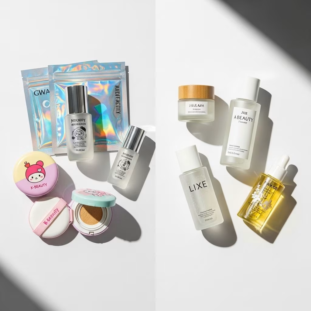
The world of skincare has been transformed by East Asian beauty philosophies, with Korean (K-Beauty) and Japanese (J-Beauty) brands gaining global acclaim. These two giants, though similar in their devotion to beautiful skin, exhibit strikingly different approaches—nowhere more so than in their packaging design. This comprehensive guide explores the nuances, cultural origins, and strategic intentions behind K-Beauty and J-Beauty packaging philosophies.
Introduction
Packaging is more than just a container—it represents a brand’s philosophy, cultural heritage, and interaction with consumers. In K-Beauty and J-Beauty, packaging is an extension of deeply rooted aesthetics and values. While both traditions believe in the transformation and enhancement of skin, the way they design, present, and invite use of their products differs greatly. Understanding these distinctions helps consumers appreciate not just the product but the thoughtful design process behind it.
Cultural Roots and Consumer Mindset
K-Beauty and J-Beauty packaging stem from the foundational philosophies of their respective societies:
- K-Beauty: Emphasizes youthfulness, vibrancy, experimentation, and fun. The packaging seeks to delight and surprise the user, reflecting a culture that embraces rapid change, innovation, and social sharing.
- J-Beauty: Embodies minimalism, longevity, and quiet sophistication. Packaging is understated yet elegant, designed to evoke a sense of tranquility and lasting quality, echoing values of subtlety and serenity in Japanese society.
Historical Context
- Japan: Influenced by principles such as wabi-sabi (beauty in imperfection), craftsmanship, and ma (the space between objects); respect for nature and ritual is central.
- Korea: Driven by a post-war surge in innovation, a desire for visible results, and a strong digital culture that encourages sharing of novel and “Instagrammable” experiences.
Consumer Expectations
- Japan: Prefers products that are discreet, functional, and timeless. Japanese consumers value high-quality, often luxury goods and associate minimalism with authenticity.
- Korea: Looks for excitement, novelty, and multi-step experiences. Products are expected to be visually appealing, playful, and to provide a sensory experience from the moment they are touched or opened.
J-Beauty Packaging Design Philosophy
J-Beauty brands express their country’s devotion to simplicity, subtlety, and tradition through packaging. The packaging itself is considered a form of art and ritual.
- Minimalist Design: Clean lines, soft color palettes (whites, creams, muted pastels), and elegant typographic choices define J-Beauty packages. There is a preference for harmony between product lines, enabling a seamless visual landscape on store shelves and vanities.
- Functionality: Packaging is designed for ease and convenience, often using pump bottles, resealable sachets, and other user-friendly features. The focus is on practicality without distraction.
- Sensory Subtlety: Materials are often matte or soft-touch, imparting a natural, refined feeling that aligns with Japan’s love of tactile, calming experiences. The unboxing experience feels measured and pure.
- Quality Signaling: Subtle cues like weighted glass, lacquer finishes, or embossed logos signal premium quality; products such as Tatcha, Shiseido, and SK-II exemplify this approach.
- Eco-Consciousness: A growing emphasis on recyclable materials and reduction of excess has led to streamlined, environmentally-friendly packaging.
Key Characteristics of J-Beauty Packaging
- Coherence: Monochrome or fluid color schemes across product ranges foster brand recognition and a sense of calm.
- Luxury with Restraint: Even high-end products avoid ostentation, preferring subtle luxury over bold statements.
- Tradition Honored: Motifs inspired by nature such as cherry blossoms or waves appear in a non-dominant, harmonizing way, celebrating Japan’s cultural roots.
K-Beauty Packaging Design Philosophy
By contrast, K-Beauty brands are celebrated for their whimsical, innovative, and attention-grabbing packaging. There’s an unmissable air of youthfulness and play in both mass-market and boutique products.
- Playful Aesthetics: Bright, bold colors, creative shapes (think fruit-shaped containers or cartoon animal motifs), and unapologetic fun define K-Beauty packaging.
- Thematic Campaigns: Collaborations with pop culture icons, seasonal themes, and limited-edition releases are common. These approaches drive collectability and social sharing.
- Innovative Functionality: K-Beauty pioneered unique applicators (such as cushion compacts) and multi-chamber bottles, adding surprise and delight to the user experience.
- Sensory Engagement: The packaging is designed to be tactile and interactive—from peel-off outer sleeves to custom-designed cap toppers. Fragrance, sound, and visual cues all work to create a sensory adventure.
- Accessibility and Mass Appeal: The packaging is intended to be “Instagrammable,” appealing to younger consumers who value aesthetics as much as efficacy.
Key Characteristics of K-Beauty Packaging
- Trendy and Changeable: Product lines frequently update packaging to keep up with fast-moving trends and social media fads.
- Variety and Customization: Different rituals and skin needs are reflected in diverse, sometimes even personalized packaging.
- Storytelling: Each package tells a story—either through character mascots, visual puns, or playful copywriting—making it memorable and social media-friendly.
Side-by-Side Comparison Table
| Aspect | J-Beauty Packaging | K-Beauty Packaging |
|---|---|---|
| Design Philosophy | Minimalist, elegant, subtle | Playful, bold, attention-grabbing |
| Color Palettes | Soft hues, cream/white, natural pastels | Bright, varied, with gradients and patterns |
| Shapes | Sleek, functional bottles and jars | Novelty shapes (fruits, animals, pop icons) |
| Material Choices | Quality glass, soft-touch plastic, minimal labels | Mixed materials, glossy plastics, foils, stickers |
| Sustainability | Streamlined, recyclable, refills prioritized | Improving but more disposable, focus on fun |
| User Experience | Simple and calming usage, ritualized | Interactive, surprising, sensory-driven |
| Collectability | Low; focused on continuity | High; frequent limited-editions |
| Target Audience | Mature, discerning, prefers longevity | Younger, trend-driven, social-media active |
Visual Identity: Colors, Shapes, and Brand Recognition
K-Beauty brands often use vivid, dynamic colors and packaging that plays with unique or cartoonish forms. Examples include TonyMoly’s fruit-shaped hand creams and Etude House’s pastel-pink castles. Character collaborations (with LINE Friends, Disney, anime, etc.) add familiarity and collectability.
J-Beauty leans towards understated sophistication: Shiseido’s subtly curved bottles, SK-II’s minimalist glass jars, and Tatcha’s soft lavender and gold accents all embody an instantly recognizable yet calming luxury. Cohesive visual themes foster trust and permanence, catering to consumers seeking timelessness rather than the ephemeral excitement of trends.
Material Choices and Eco-Friendliness
- J-Beauty: Stresses sustainability, functionality, and reduction of waste. Lightweight, recyclable materials, and refill systems are commonly used. Minimal outer packaging minimizes environmental impact.
- K-Beauty: While increasingly aware of environmental issues, K-Beauty’s frequent use of novelty containers, multilayered plastics, and decorative accessories can generate excess packaging waste, though brands are gradually introducing eco-friendlier options.
Consumer Experience: Usability and Ritual
- K-Beauty: Packages are often part of a larger, multi-step ritual. Special containers (droppers, ampoule bottles, rollerball serums) are designed for daily play and discovery. Each step in the 10+ step routine has a defined pack and presentation.
- J-Beauty: Encourages a minimalist, streamlined routine. Packaging contributes to effortless, almost invisible integration into daily life—”uncluttered beauty” applied with ease. Products often consolidate multiple functions (lotion, essence, moisturizer) into one.
Innovations and Contemporary Trends
- K-Beauty:
- Pioneered cushion compacts, fun fruit- and animal-themed packs, and “sleeping mask” jars.
- Popularized sensory sheet mask pouches with holographic and patterned designs.
- Embraces technology: airless pumps, built-in applicators, and personalized QR code scanning are on the rise.
- J-Beauty:
- Focus on advanced materials: ultra-fine sheet masks, glass dropper bottles, and precision pump dispensers.
- Low-waste refills and “naked” product designs that reduce branding to a discreet label, letting the product quality speak.
- Increasing use of smart packaging, sustainability, and slow-batch luxury production.
Global Influence and Marketing Impact
The global rise of East Asian beauty has brought packaging distinction to the fore:
- K-Beauty: Heavily marketed online and thrives in influencer culture. Its “Instagrammable” appeal has increased its penetration into Western markets, drawing a young demographic.
- J-Beauty: Relies less on aggressive marketing, instead cultivating an aura of “luxury discovered”. Japanese packaging carries connotations of sophistication and quality, appealing to mature audiences and luxury buyers internationally.
Frequently Asked Questions (FAQs)
Q: Why does K-Beauty use such playful and whimsical packaging?
A: K-Beauty aims to make skincare fun, shareable and visually engaging. The playful packaging targets young, trend-conscious consumers and helps drive word-of-mouth, particularly on social media platforms where visual appeal is key.
Q: Is J-Beauty packaging always minimalist?
A: While not all Japanese brands are starkly minimalist, there is a prevailing emphasis on subtlety, harmony, and function. Even luxury or decorative lines tend to avoid excess, focusing on refinement and lasting design.
Q: Which is more eco-friendly: K-Beauty or J-Beauty packaging?
A: Generally, J-Beauty places a stronger emphasis on eco-conscious design, using recyclable materials and refill systems. K-Beauty is making strides in this area, but its love for novelty sometimes increases packaging waste.
Q: Does packaging really influence skincare experience?
A: Yes. Packaging can enhance usability, ritual, and even the emotional connection to a product. In K-Beauty, packaging amplifies the sense of play and discovery. In J-Beauty, it fosters calm, simplicity and quality.
Q: Are there brands that blend both philosophies?
A: Increasingly, brands influenced by global trends are incorporating both playful and minimalist elements, especially as Western markets embrace East Asian skincare. However, most brands maintain their core philosophies rooted in their cultural origins.
In summary, K-Beauty and J-Beauty packaging design philosophies reflect the heartbeat of their respective cultures: one is playful and experimental, the other poised and understated. Both offer valuable perspectives, enriching the global beauty landscape by elevating packaging into an art form and experience in itself.
References
- https://buymejapan.com/blogs/japanese-skincare-and-beauty/japanese-vs-korean-skincare-8-key-distinctions-1
- https://blog.covalo.com/personal-care/japanese-beauty-trends
- https://in.ilemjapan.com/blogs/news/j-beauty-vs-k-beauty
- https://shikobeauty.com/blogs/culture/whats-the-difference-between-k-beauty-and-j-beauty-skincare
- https://www.albiongarden.com/blogs/news/j-beauty-and-k-beauty-what-are-the-key-differences
- https://www.beautypackaging.com/exclusives/how-beauty-trends-differ-throughout-asia/
- https://www.tatcha.com/blog/j-beauty-vs-k-beauty.html
- https://www.beautypackaging.com/exclusives/unveiling-the-latest-beauty-trends-from-japan-and/