

Unveiling the True Colors of Uranus and Neptune
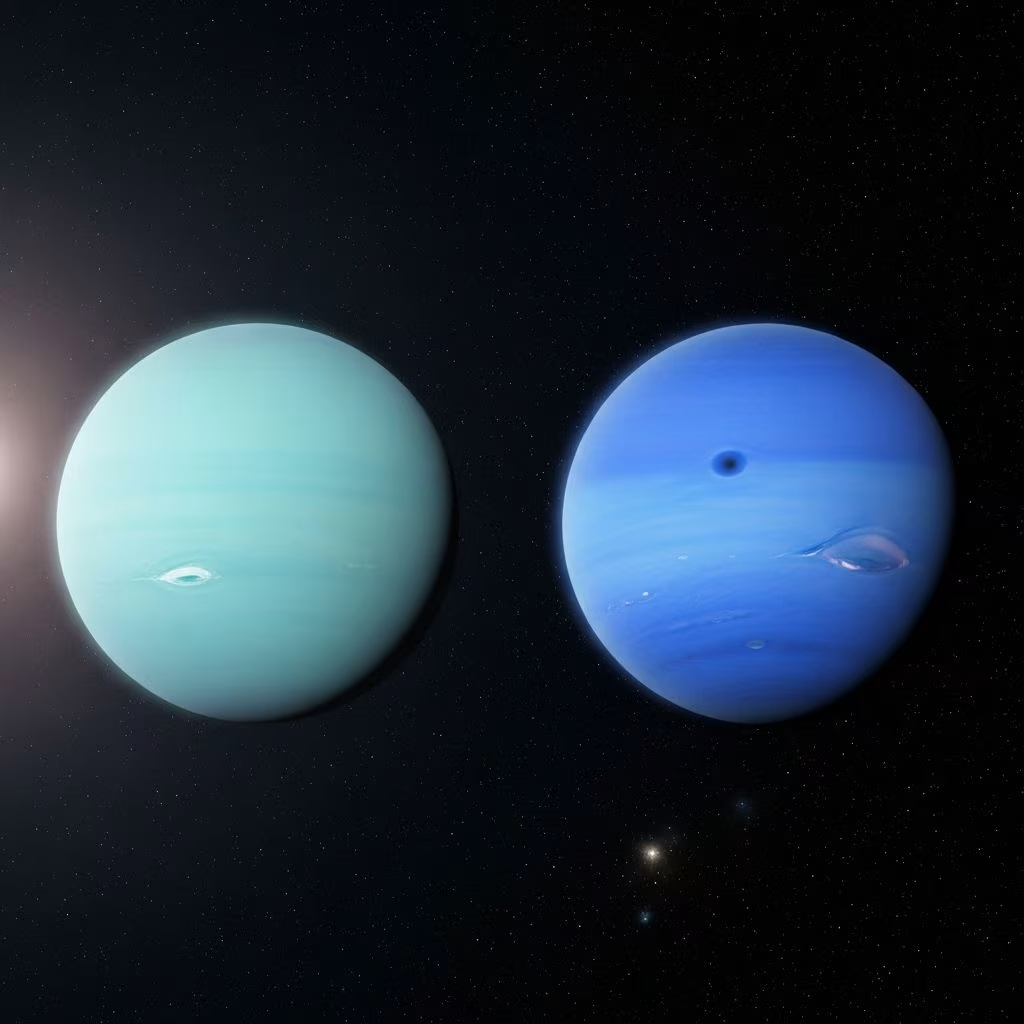
For decades, the planets Uranus and Neptune have fascinated astronomers, planetary scientists, and space enthusiasts alike—not only because of their distance from Earth as the seventh and eighth planets in our solar system, but also for their strikingly different appearances in popular images. Traditionally, Neptune has been depicted as an intense, deep azure, while Uranus is shown as a paler blue-green world. However, a groundbreaking study that integrated Voyager 2 spacecraft imagery with advanced data from the Hubble Space Telescope and the Very Large Telescope has dramatically revised our understanding of these planetary giants’ true shades. The new findings reveal that Uranus and Neptune are, in reality, far more similar in color than the iconic images suggest.
The Legacy of Voyager 2’s Planetary Portraits
Launched by NASA in 1977, the Voyager 2 mission became the first—and only—spacecraft to fly by both Uranus and Neptune, conducting close encounters in 1986 and 1989, respectively. The images it sent back were among the most detailed ever obtained and cemented popular conceptions of the giant planets’ appearances. Voyager’s sensors captured Neptune’s enigmatic dark spots and bright clouds, features that were then dramatically enhanced during processing.
- Voyager 2 flew by Uranus in 1986 and Neptune in 1989.
- The legendary images from the mission painted Neptune as a brilliant blue orb—strikingly different from Uranus’ greenish tinge.
- This contrast became a fixture in educational material and planetary atlases across the world.
Yet, as powerful as these images were in sparking the imagination, they did not necessarily represent how the planets would actually appear to the naked eye.
How Planetary Colors Become Distorted
The reason for the historical misrepresentation lies in a classic technique of planetary imaging: scientists often re-balance or heighten features in images to highlight aspects of a planet’s atmosphere or surface that are otherwise difficult to see. For the ice giants, both the choice of filters aboard Voyager’s cameras and the image compositing procedures led to an exaggeration of color differences and atmospheric patterns between Uranus and Neptune.
- The Voyager imaging team deliberately processed images to emphasize clouds, storms, and banding, which meant boosting contrast and exaggerating subtle color distinctions between the two planets.
- Different camera filters assigned to red, green, and blue channels did not directly correspond to how human eyes perceive light, creating an artificial separation of colors.
- Neptune’s Great Dark Spot and bright clouds were made more visible—but at the cost of accuracy in overall hue.
Consequently, the widespread depiction of Neptune as a vibrant blue and Uranus as a faded green was more an artifact of imaging practices than planetary reality.
Reprocessing the Data: A Modern Approach
To correct the historical record, a team led by Dr. Patrick Irwin of the University of Oxford undertook a comprehensive reanalysis of Voyager 2’s data, supplemented by state-of-the-art spectroscopic observations from the Hubble Space Telescope (HST) and the Very Large Telescope (VLT). This methodology allowed them to reconstruct the planets’ appearances as they would be seen by human eyes, providing a more scientifically accurate view.
- Spectral data from HST’s Imaging Spectrograph and Wide Field Camera 3, along with the VLT’s Multi Unit Spectroscopic Explorer, were essential in deriving continuous color information across the visible spectrum.
- Each pixel in these datasets contained rich spectral details, enabling researchers to ‘rebalance’ Voyager’s composite images in a process designed to accurately approximate natural color.
- The resulting images provide the most reliable representation yet of the true colors of Uranus and Neptune.
According to Irwin’s team, this breakthrough “brings us as close as possible to how these ice giants would look if we could visit them in person.”
What Do Uranus and Neptune Really Look Like?
The new analysis overturns decades of assumptions: both Uranus and Neptune are very similar in color, appearing as subtle, cool blue-greens rather than dramatically different shades. Neptune is marginally bluer than Uranus, but the difference is modest—not the dramatic dichotomy seen in earlier processed images.
| Planet | Traditional Representation | True Color (Corrected) | Key Reasons for Shade |
|---|---|---|---|
| Neptune | Deep, vibrant azure blue | Light greenish blue; slightly more blue than Uranus | Thinner atmospheric haze, enhanced methane absorption |
| Uranus | Pale greenish-blue or turquoise | Pale bluish-green, closely matching Neptune | Thicker haze layer, methane ice ‘hood’ at poles |
- Neptune’s slightly thinner haze over its upper atmosphere lets more blue light scatter and escape, accounting for its subtle edge toward stronger blues.
- Uranus’ thicker haze mutes its color, contributing a slightly greener tint.
- Both planets’ atmospheres are primarily hydrogen and helium, with significant methane, which absorbs red light and imparts a blue-green cast.
Seasonal Color Shifts on Uranus
An intriguing aspect uncovered during these studies is Uranus’ mild but real color variability over its long 84-year orbit around the Sun. Researchers found that Uranus appears a bit greener during its solstices (when either the north or south pole is tipped toward the Sun), compared to the periods around its equinoxes.
- The change is caused by a ‘hood’ of icy methane that forms at Uranus’ polar regions, reflecting more green and red wavelengths during solstices.
- This polar hood is absent at the equator, so Uranus looks less green around the equinox.
- While visible, the seasonal shift is relatively minor—far less than the overblown color differences popularized by old processed imagery.
Why Did Scientists Emphasize Feature Contrast?
The deliberate exaggeration of planetary colors and features in historical images wasn’t intended to mislead; rather, it was a strategic choice made for scientific clarity. Many atmospheric features on Uranus and Neptune are genuinely faint. By tweaking contrast and color balances, scientists could bring out important aspects for research and public engagement:
- Subtle bands, storms, and cloud patterns became visible and analyzable in enhanced images.
- Striking features, like Neptune’s Great Dark Spot, were more readily studied with heightened contrast.
- Education and outreach benefited from vivid imagery, even if it sacrificed literal accuracy.
However, as Dr. Irwin notes, the cost was a generation of misconceptions about the true look of the ice giants: “The difference in color was nothing like what you see when you Google for images of Uranus and Neptune,” he told journalists.
Implications for Our Understanding of the Ice Giants
Correcting the color record goes beyond aesthetic concerns; it helps scientists draw more accurate conclusions about planetary atmospheres, chemistry, and climate behavior. The key takeaways from Irwin’s study and supporting investigations include:
- Both Uranus and Neptune have atmospheres rich in hydrogen, helium, and methane, producing fundamentally similar blue-green hues.
- The thickness and composition of atmospheric hazes play a crucial role in subtle color differences.
- Understanding true colors clarifies how sunlight interacts with upper atmosphere gases, which in turn impacts energy balance and seasonal shifts.
- Visually, both planets would appear much closer to icy aquamarine or teal rather than the contrasting blue and turquoise shown in textbooks.
Why This Matters to Astronomy and the Public
This correction of decades-old misconceptions teaches scientists, educators, and the wider public a valuable lesson on the importance of how data is processed and presented. The distinction between ‘scientific’ and ‘true’ color invites ongoing scrutiny of how other planetary and astronomical imagery may be shaped by technical, rather than visual, realities.
Moreover, the new images enhance our understanding of planetary atmospheres elsewhere in the galaxy. Many exoplanets discovered are Neptune-like “mini-Neptunes” or “ice giants,” and learning how light interacts with Uranus and Neptune’s atmospheres helps inform models for distant worlds.
Frequently Asked Questions (FAQs)
Q: Why were Neptune and Uranus previously depicted as dramatically different colors?
A: Early images from Voyager 2 were intentionally processed with exaggerated contrasts and color differences to make the subtle atmospheric features easier to detect and analyze. This practice led to artificially saturated and divergent portraits of the planets.
Q: How did scientists uncover the true colors of Neptune and Uranus?
A: By combining Voyager 2 data with spectral information from the Hubble Space Telescope and the Very Large Telescope, researchers reconstituted the planets’ colors as they would appear to human eyes, correcting for decades of distorted imagery.
Q: What is the main atmospheric ingredient responsible for the blue-green color of both planets?
A: Methane, which absorbs red light and allows blue and green light to scatter back into space, is the key molecule giving Uranus and Neptune their characteristic hue.
Q: Is there still a visual difference between Neptune and Uranus?
A: Although both planets are remarkably similar in shade, Neptune is still slightly bluer than Uranus due to its thinner haze layer.
Q: What does this reveal about planetary imaging in general?
A: The history of Uranus and Neptune’s colors underscores the importance of image processing decisions and reminds us to examine space images with a critical eye for both scientific accuracy and visual enhancement.
Citation Note
Information in this article was synthesized from recent scientific publications and news summaries regarding the reanalysis of Voyager 2, Hubble, and VLT data, with particular reference to statements by Dr. Patrick Irwin and details about imaging techniques as described in major astronomy news outlets and scientific journals.
References
- https://www.space.com/uranus-neptune-similar-shades-of-blue-voyager-2-images
- https://www.youtube.com/watch?v=zKSWcFCMrGU
- https://www.planetary.org/articles/uranus-neptune-color-difference
- https://www.opb.org/article/2024/01/05/don-t-look-so-blue-neptune-now-astronomers-know-this-planet-s-true-color/
- https://www.livescience.com/space/uranus/neptune-isnt-as-blue-as-you-think-and-these-new-images-of-the-planet-prove-it
- https://www.kcrw.com/news/shows/npr/npr-story/1222906151
- https://www.inverse.com/science/voyager-2-neptune-uranus-color-blue
- https://www.sci.news/astronomy/uranus-neptune-true-colors-12589.html
- https://www.nasa.gov/solar-system/30-years-ago-voyager-2s-historic-neptune-flyby/
- https://www.universetoday.com/articles/uranus-and-neptune-are-actually-pretty-much-the-same-color
- https://universemagazine.com/en/the-real-color-of-neptune-turns-out-to-be-not-blue/
- https://www.worldysnews.com/neptune-and-uranus-actually-share-a-blue-green-color/
- https://en.wikipedia.org/wiki/File:Neptune_Voyager2_color_calibrated.png
- https://www.colorpsychology.org/colors-of-neptune-and-uranus/
- https://www.accuweather.com/en/space-news/color-corrected-images-reveal-accurate-portraits-of-uranus-and-neptune/1609532